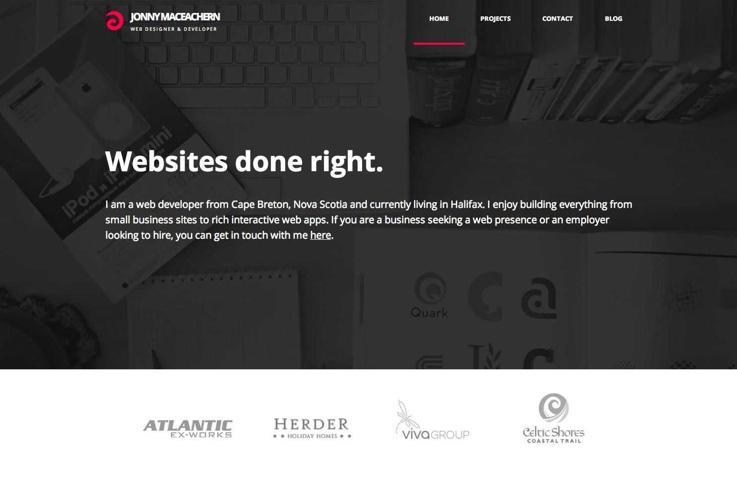
Jonny MacEachern is web developer from Nova Scotia. He graduated college in Spring and is currently looking for a job that allows him to travel and work remotely. One of the biggest strengths of Jonny's portfolio is it's simplicity. It's one page of hand-coded HTML/CSS without using any CMS or frameworks, and puts a strong focus on his work. Let's jump in and look at the biggest takeaways that you can use to improve your portfolio.
Note: This portfolio example is image heavy, and best viewed on as big a screen as possible.
Working on your portfolio?
Get my free portfolio checklist (at PortfolioTips.co)—I've broken out the 10 most important things to include in your portfolio. Also includes 3 bonus ways to make your portfolio stand out from the crowd.
Homepage / Portfolio

A) Including a personal header image
This background shot of what looks like Jonny's actual desk is beautifully personal. It begins to give you a feeling for how Jonny works and gives the impression that Jonny is transparent about his work and process. Including a visual of something personal related to your work really helps the visitor connect with who you are and what you do.
B) Clarifying what you offer, and what you're looking for
Jonny does a great job here of making it clear that he loves building any type of website, and clarifies that he's looking for freelance or full-time work. Explaining the types of employers or clients that you'd like to work with will help them feel like you're a good match for each other.
C) Ensuring client logos are clearly labeled
These logos could be companies that Jonny has worked with or maybe logos that he designed? It's also a little confusing that they have hover states but aren't linked to anything. A sub-header to clarify the purpose of these logos or removing them would work, as the companies are listed below.
D) Getting straight to your work
Thanks, Jonny! I'm here to see your work and you put it right in front of me. Including your work as early as possible is awesome, it's the most important part of your portfolio and what everyone is here to see.
E) Including big screenshots of your work
These huge screenshots are allow us to see Jonny's projects really quickly, and they look great! Including big screenshots makes it easy for employers to quickly browse through your work and get a feel for it's quality.
F) Including gifs to demonstrate functionality
Given that Tweetmap is an interactive application rather than a static website, a gif would be helpful to demonstrate the functionality to us. LICEcap is a free, easy to use mac app that lets you record gifs via screen capture.
G) Including links to the live websites
It's great that we can view Jonny's live work, it adds to the feel of transparency and authenticity that his portfolio gives off. Including links to the live websites is great, it especially helps with something that's interactive like Tweetmap. If you can't link to live websites, that's OK, this is a nice-to-have not a requirement for a portfolio.
H) Creating expected behaviours when linking to external sites
It was jarring when I clicked on the screenshot for the project and it opened the live site in a new tab. I had expected that it would either give me a bigger screenshot or take me to a page specific to that project. When linking out to live sites it's good to make sure that the visitor expects to be taken off-site, especially if you're using target=”_blank”. I wouldn't link the project image and header here, and instead include a text link to "View the live website" under the description.
I) Telling us about how you built the website
As awesome as Atlantic Ex-Works probably are, I'd much rather hear about how Jonny built their website. One sentence on the company should be enough to show that you understand the businesses that you're working with. Then writing a paragraph about one thing you really enjoyed building on the website (or one thing you did to benefit the client) would help give us insight into your process, as well as showing passion for your work.
J) Listing the technologies you used
Jonny shows off the technologies he's used to build each project, making it really easy to see how each of them were built at a glance. Including a list of the frameworks and technologies used for each project is a great way to make it clear that you have hands-on experience building projects using technologies that the employer is looking for. The more relevant to them, the better.
K) Making it easy to view projects one-by-one
Jonny makes great use of vertical whitespace so that each individual project fits on your screen one-by-one as you scroll down. Including a way to view each project individually like this makes it easy for employers to take in information about each project one at a time, without being overwhelmed.
L) Including a pic of yourself
Jonny missed an opportunity here to make the contact section feel more personal by including a picture of his face instead of a shadowed out avatar. Including a picture of yourself really helps connects with the employer, we all like to see who we're going to be working with.
M) Including readily available contact information
There are three different ways to email Jonny in his contact section. I love that it's so easy to get in touch with him. Including a number of ways to contact you makes it easier for employers to pick their preferred way of reaching out. It's also fantastic for transparency, I get the impression that if I work with Jonny he's going to be readily available.
Tip: Writing clean code
Prepare to be impressed when taking a peek under the hood of Jonny's site. All of his markup has been hand-coded and it's super tidy and well written, with helpful comments. Writing clean code is important if an employer will be assessing your coding skill as it shows the type of attention to detail they should expect when you're working for them. Unsure if your code is up to scratch? Ask a couple of developer friends to review your portfolio's code.
The most important things that we can learn from Jonny's portfolio...
Your portfolio is improved with personality
Jonny strikes a good balance of keeping his portfolio professional, while adding in personal touches like his header image. Employers want to hire candidates that they're going to enjoy working with so it's great to show some personality in your portfolio.
Make your work is accessible
All of Jonny's projects are on the front page, we don't have to do any hunting around to find them. This gives us the sense that Jonny is both transparent and confident in his work. However you're showing your work, it helps to make it extremely quick to locate.
Attention to detail is important
Jonny has a tremendous attention to detail in his portfolio website. The responsive design is fantastic and viewing the site on mobile looks just as awesome as the desktop version. Showing an attention to detail will help your hiring chances greatly, as it gives employers the impression that you're going to treat their projects with that same level of focus.

